Working with risk trends in reports
Risks change over time as vulnerabilities are discovered and old vulnerabilities are remediated on assets or excluded from reports. As system configurations are changed, assets or sites that have been added or removed also will impact your risk over time. Vulnerabilities can lead to asset compromise that might impact your organization’s finances, privacy, compliance status with government agencies, and reputation. Tracking risk trends helps you assess threats to your organization’s standings in these areas and determine if your vulnerability management efforts are satisfactorily maintaining risk at acceptable levels or reducing risk over time.
A risk trend can be defined as a long-term view of an asset’s potential impact of compromise that may change over a time period. Depending on your strategy you can specify your trend data based on average risk or total risk. Your average risk is based on a calculation of your risk scores on assets over a report date range. For example, average risk gives you an overview of how vulnerable your assets might be to exploits whether it’s high or low or unchanged. Your total risk is an aggregated score of vulnerabilities on assets over a specified period. See Prioritize according to risk score for more information about risk strategies.
Over time vulnerabilities that are tracked in your organization’s assets indicate risks that may have be reflected in your reports. Using risk trends in reports will help you understand how vulnerabilities that have been remediated or excluded will impact your organization. Risk trends appear in your Executive Overview or custom report as a set of colored line graphs illustrating how your risk has changed over the report period.
See Selecting risk trends to be included in the report for information on including risk trends in your Executive Overview report.
Events that impact risk trends
Changes in assets have an impact on risk trends; for example, assets added to a group may increase the number of possible vulnerabilities because each asset may have exploitable vulnerabilities that have not been accounted for nor remediated. Using risk trends you can demonstrate, for example, why the risk level per asset is largely unchanged despite a spike in the overall risk trend due to the addition of an asset. The date that you added the assets will show an increase in risk until any vulnerabilities associated with those assets have been remediated. As vulnerabilities are remediated or excluded from scans your data will show a downward trend in your risk graphs.
Changing your risk strategy will have an impact on your risk trend reporting. Some risk strategies incorporate the passage of time in the determination of risk data. These time-based strategies will demonstrate risk even if there were no new scans and no assets or vulnerabilities were added in a given time period. For more information, see Selecting risk trends to be included in the report.
Configuring reports to reflect risk trends
Configure your reports to display risk trends to show you the data you need. Select All assets in report scope for an overall high-level risk trends report to indicate trends in your organization’s exploitable vulnerabilities. Vulnerabilities that are not known to have exploits still pose a certain amount of risk but it is calculated to be much smaller. The highest-risk graphs demonstrate the biggest contributors to your risk on the site, group, or asset level. These graphs disaggregate your risk data, breaking out the highest-risk factors at various asset collection methods included in the scope of your report.
The risk trend settings in the Advanced Properties page of the Report Configuration panel will not appear if the selected template does not include ‘Executive overview’ or ‘Risk Trend’ sections.
You can specify your report configuration on the Scope and Advanced Properties pages of the Report Configuration panel. On the Scope page of the report configuration settings you can set the assets to include in your risk trend graphs. On the Advanced Properties page you can specify on which asset collections within the scope of your report you want to include in risk trend graphs. You can generate a graph representing how risk has changed over time for all assets in the scope of the report. If you generate this graph, you can choose to display how risk for all the assets has changed over time, how the scope of the assets in the report has changed over time or both. These trends will be plotted on two y-axes. If you want to see how the report scope has changed over the report period, you can do this by trending either the number of assets over the report period or the average risk score for all the assets in the report scope. When choosing to display a trend for all assets in the report scope, you must choose one or both of the two trends.
You may also choose to include risk trend graphs for the five highest-risk sites in the scope of your report, or the five highest-risk asset groups, or the five highest risk assets. You can only display trends for sites or asset groups if your report scope includes sites or asset groups, respectively. Each of these graphs will plot a trend line for each asset, group, or site that comprises the five-highest risk entities in each graph. For sites and groups trend graphs, you can choose to represent the risk trend lines either in terms of the total risk score for all the assets in each collection or in terms of the average risk score of the assets in each collection.
You can select All assets in report scope and you can further specify Total risk score and indicate Scope trend if you want to include either the Average risk score or Number of assets in your graph. You can also choose to include the five highest risk sites, five highest risk asset groups, and five highest risk assets depending on the level of detail you want and require in your risk trend report. Setting the date range for your report establishes the report period for risk trends in your reports.
Tip: Including the five highest risk sites, assets, or asset groups in your report can help you prioritize candidates for your remediation efforts.
Asset group membership can change over time. If you want to base risk data on asset group membership for a particular period you can select to include asset group membership history by selecting Historical asset group membership on the Advanced Properties page of the Report Configuration panel. You can also select Asset group membership at the time of report generation to base each risk data point on the assets that are members of the selected groups at the time the report is run. This allows you to track risk trends for date ranges that precede the creation of the asset groups.
Selecting risk trends to be included in the report
You must have assets selected in your report scope to include risk trend reports in your report. See Selecting assets to report on for more information.
To configure reports to include risk trends:
- Select the Executive Overview template on the General page of the Report Configuration panel. (Optional) You can also create a custom report template to include a risk trend section.
- Go to the Advanced Properties page of the Report Configuration panel.
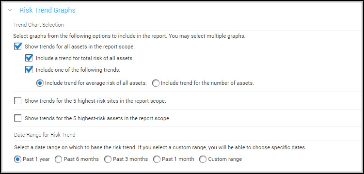
- Select one or more of the trend graphs you want to include in your report: All assets in report scope, 5 highest-risk sites, 5 highest-risk asset groups, and 5 highest-risk assets. To include historical asset group membership in your reports make sure that you have selected at least one asset group on the Scope page of the Report Configuration panel and that you have selected the 5 highest-risk asset group graph.
- Set the date range for your risk trends. You can select Past 1 year, Past 6 months, Past 3 months, Past 1 month, or Custom range.
- (Optional) You can select Use the report generation date for the end date when you set a custom date range. This allows a report to have a static custom start date while dynamically lengthening the trend period to the most recent risk data every time the report is run.
Your risk trend graphs will be included in the Executive Overview report on the schedule you specified. See Selecting risk trends to be included in the report for more information about understanding risk trends in reports.
Use cases for tracking risk trends
Risk trend reports are available as part of the Executive Overview reports. Risk trend reports are not constrained by the scope of your organization. They can be customized to show the data that is most important to you. You can view your overall risk for a high level view of risk trends across your organization or you can select a subset of assets, sites, and groups and view the overall risk trend across that subset and the highest risk elements within that subset.
Overall risk trend graphs, available by selecting All assets in report scope, provide an aggregate view of all the assets in the scope of the report. The highest-risk graphs provide detailed data about specific assets, sites, or asset groups that are the five highest risks in your environment. The overall risk trend report will demonstrate at a high level where risks are present in your environment. Using the highest-risk graphs in conjunction with the overall risk trend report will provide depth and clarity to where the vulnerabilities lie, how long the vulnerabilities have been an issue, and where changes have taken place and how those changes impact the trend.
For example, Company A has six assets, one asset group, and 100 sites. The overall risk trend report shows the trend covering a date range of six months from March to September. The overall risk graph has a spike in March and then levels off for the rest of the period. The overall report identifies the assets, the total risk, the average risk, the highest risk site, the highest risk asset group, and the highest risk asset.
To explain the spike in the graph the 5 highest-risk assets graph is included. You can see that in March the number of assets increased from five to six. While the number of vulnerabilities has seemingly increased the additional asset is the reason for the spike. After the asset was added you can see that the report levels off to an expected pattern of risk. You can also display the Average risk score to see that the average risk per asset in the report scope has stayed effectively the same, while the aggregate risk increased. The context in which you view changes to the scope of assets over the trend report period will affect the way the data displays in the graphs.