Changes to the User Interface and Experience
For enhanced usability, a cohesive experience across Rapid7 products, and moving away from the Angular codebase, we improved the user experience through changes to the user interface (UI).
Cloud Listing Page
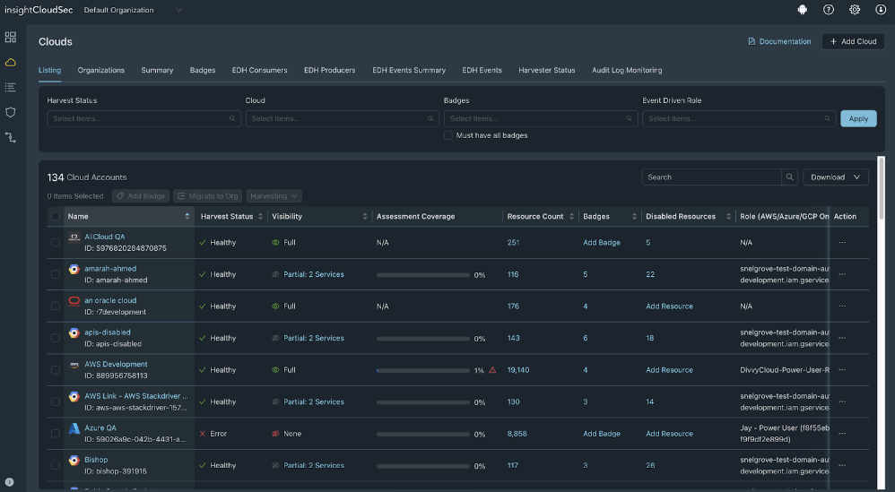
The Cloud Listing page, accessed from Cloud > Cloud Accounts > Listing, has been improved to display the most important information and actions without overloading the screen. Changes include the following:
| UI Element | Change description |
|---|---|
| Download missing permissions | To quickly export these missing permissions instead of taking screenshots or provisioning a basic user, you can now download the missing permissions in each cloud account to send to the Azure admin who can update the correct permissions. |
| Table layout | Some less utilized columns were combined to improve usability. |
| Color scheme | The color scheme now uses dark mode. |
| Harvesting controls | More intuitive controls: Start, Pause, and Stop |
| Improved experiences for in-page windows | The display and experience for the following in-page windows is improved:
|
| CSV downloads | CSV downloads are asynchronous, so you can navigate to another page while the download is in progress. |
| Filters | Filter upgrades improve filtering capabilities |
| Performance | We improved performance and fixed bugs |
| Actions | Some actions have been moved. |
| Bulk operations | Bulk operations are no longer icons at the top left, they are always present and are activated when a user selects bulk operations. |
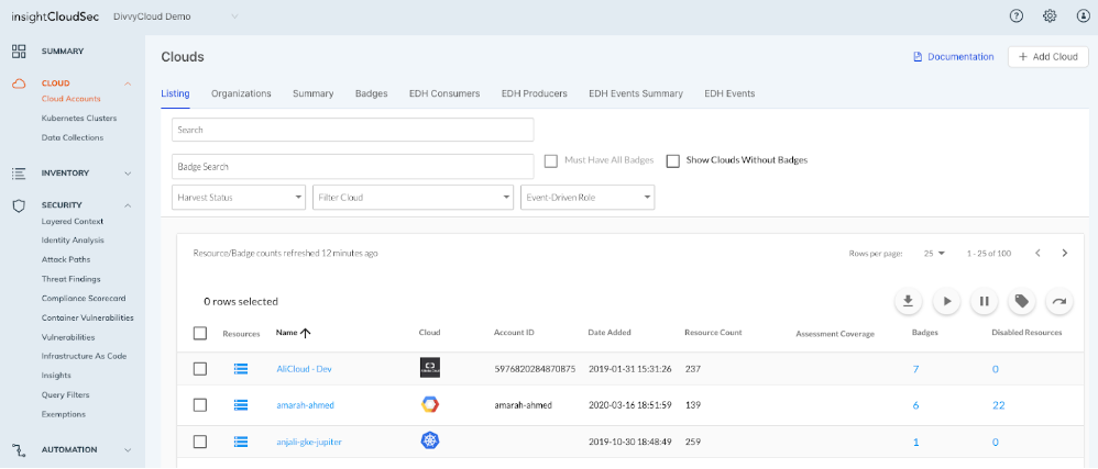
Previous Cloud Listing page
Before version 23.8.1, the Clouds listing page looked as follows.

Updated Cloud Listing page
As of version 23.8.1, the Clouds listing page looks as follows.

Product Documentation
To provide a consistent product documentation experience across all Rapid7 products, the Cloud Security (InsightCloudSec) product documentation moved from docs.divvycloud.com to docs.rapid7.com/insightcloudsec. Changes to the documentation experience include the following:
- Reorganized menu with high-level headers for improved navigation and content grouping
- Consolidation of smaller, related help pages into a single page of helpful content. For example,
Layered Content - User Guideis now part of the Layered Context help page to present all relevant information in one place. - Less screenshots to reduce the amount of scrolling on each page and provide the same level of detail without a redundant image.
- The release notes can be found on the Command Platform Release Notes site.
- API Documentation displays all calls and has an easily navigable sample and testing area
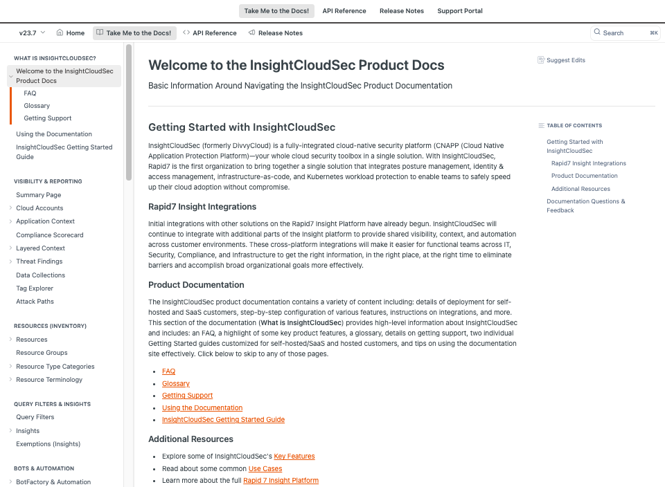
Previous product documentation
Before version 23.8.1, the product documentation looked as follows.

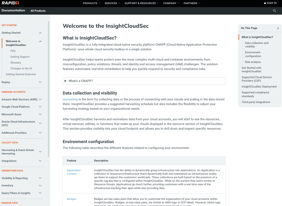
Updated product documentation
As of version 23.8.1, the product documentation looks as follows.
